Building Flexible, Styled ListItems in SwiftUI
Listitems are probably one of the most used design elements in any app. In this post, I'll walk through how I create listitems that are easy to use and flexible when needed, how to define different types of listitems, and how to handle slot items.
What we are gonna build
A good listitem should be as easy to use as a Text view and just as flexible. When I work on list-based UIs, I want to spin up simple items quickly, style text inline if needed, and insert leading/trailing content with minimal effort. That’s what this system aims to make easy.
In the image below, you see three listitems:
- A listitem with just a title—the absolute barebone version
- A listitem showing it all: a label, title, subtitle, and detail
- Like #2, but with views in the leading and trailing slots
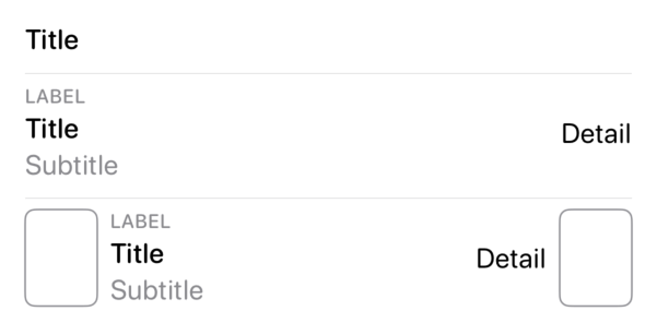
You’ll notice that each text element has its own style. We'll make it easy to get a listitem up and running with a default style but also make it possible to style each text individually. What we won’t cover is spacing—we’ll just rely on SwiftUI and leave it to you to tweak the spacing of your own listitems.
Before we dive into creating the listitem system, here’s the code behind the picture:
MyListItem(
    title: "Title"
)

MyListItem(
    label: "Label",
    title: "Title",
    subtitle: "Subtitle",
    detail: "Detail"
)

MyListItem(
    label: "Label",
    title: "Title",
    subtitle: "Subtitle",
    detail: "Detail"
)
.listItemLeadingSlot {
    RoundedRectangle(cornerRadius: 6)
        .stroke(Color.gray)
        .frame(width: 44)
}
.listItemTrailingSlot {
    RoundedRectangle(cornerRadius: 6)
        .stroke(Color.gray)
        .frame(width: 44)
}
Defining a listitem
The listitem we’ll build today will support four text elements, with title being required. It's up to you to decide how your listitems should look in your app.
Let’s first look at the core structure of the listitem:
struct MyListItem: View {

    private let label: Text?
    private let title: Text
    private let subtitle: Text?
    private let detail: Text?

    init(
        label: Text? = nil,
        title: Text,
        subtitle: Text? = nil,
        detail: Text? = nil
    ) {
        self.label = label
        self.title = title
        self.subtitle = subtitle
        self.detail = detail
    }

    var body: some View {
        HStack {
            VStack(alignment: .leading) {
                label
                title
                subtitle
            }
            .frame(maxWidth: .infinity, alignment: .leading)

            detail
        }
    }
}
Worth noting here: we store four Text values, and title is required. The body shows the label, title, and subtitle aligned to the leading edge and taking up all available horizontal space, with the detail at the trailing edge.
Since our initializer takes Text inputs, we can style them in the body while still allowing customization from the callsite. For example:
MyListItem(
    title: Text("This text is red").foregroundStyle(.red)
)
Because you can’t override the modifiers of a Text view once it’s created, applying styles in the body ensures default styling—while still allowing the callsite to fully customize the text by passing in their own styled Text. With that in mind, we will define the default styling:
// body of MyListItem
var body: some View {
    HStack {
        VStack(alignment: .leading) {
            label?
                .textCase(.uppercase)
                .font(.caption)
                .fontWeight(.medium)
                .foregroundStyle(.secondary)

            title
                .font(.body)
                .fontWeight(.medium)

            subtitle?
                .font(.body)
                .foregroundStyle(.secondary)
        }
        .frame(maxWidth: .infinity, alignment: .leading)

        detail
            .font(.body)
    }
    .fontWeight(.regular)
    .fontDesign(.rounded)
}
Our listitem looks great, and we’ve kept callsite styling flexibility. Creating a listitem still requires up to four Text views, so let’s make that easier by adding a string-based initializer:
extension MyListItem {
    init(label: String? = nil, title: String, subtitle: String? = nil, detail: String? = nil) {
        self.label = label.map { Text($0) }
        self.title = Text(title)
        self.subtitle = subtitle.map { Text($0) }
        self.detail = detail.map { Text($0) }
    }
}
Offering alternative listitems
We now have a flexible listitem that we can also tailor for specific use cases. Let’s create one for account balances:
struct AccountBalanceListItem: View {

    let title: String
    let balance: Double
    let currency: String

    var body: some View {
        MyListItem(
            title: Text(title),
            detail: Text(
                balance,
                format: .currency(
                    code: currency
                )
                .precision(
                    .fractionLength(2)
                )
            )
            .foregroundStyle(
                balance >= 0 ? .green : .red
            )
        )
    }
}
This is a tailored listitem, so it only takes the values it needs—no Text views. The body uses our base listitem, formats the balance, and styles the color based on the amount.
Tip: using the
init(_:format:)initializer on Text helps localize the value properly.
Adding slots to listitems
Listitems can have a leading and/or trailing slot. Let’s define a protocol for listitems that support slots—not all will, but we’ll get to that later:
protocol ListItemSlotable {
}
Then we extend it with methods for adding slots:
extension ListItemSlotable where Self: View {
    @MainActor
    func listItemLeadingSlot<Slot>(alignment: VerticalAlignment = .center, @ViewBuilder _ slot: () -> Slot) -> _ListItemSlotted<Self, Slot, EmptyView> where Slot: View {
        _ListItemSlotted(
            listItem: self,
            leading: _ListItemSlot(alignment: alignment, item: slot()),
            trailing: _ListItemSlot(alignment: .center, item: EmptyView())
        )
    }

    @MainActor
    func listItemTrailingSlot<Slot>(alignment: VerticalAlignment = .center, @ViewBuilder _ slot: () -> Slot) -> _ListItemSlotted<Self, EmptyView, Slot> where Slot: View {
        _ListItemSlotted(
            listItem: self,
            leading: _ListItemSlot(alignment: .center, item: EmptyView()),
            trailing: _ListItemSlot(alignment: alignment, item: slot())
        )
    }
}
A few things to note:
- The methods are identical except for leading/trailing edge
- They introduce two new types:
_ListItemSlottedand_ListItemSlot - Both return
_ListItemSlotted, notsome View
Each slot is stored in _ListItemSlot, which wraps a view and alignment:
struct _ListItemSlot<Item> where Item: View {
    let alignment: Alignment
    let item: Item

    init(alignment: VerticalAlignment, item: Item) {
        self.alignment = Alignment(
            horizontal: .center,
            vertical: alignment
        )
        self.item = item
    }
}
Now _ListItemSlotted just composes the pieces:
struct _ListItemSlotted<ListItem, Leading, Trailing>: View where ListItem: View, Leading: View, Trailing: View {

    private let listItem: ListItem
    private let leading: _ListItemSlot<Leading>
    private let trailing: _ListItemSlot<Trailing>

    init(listItem: ListItem, leading: _ListItemSlot<Leading>, trailing: _ListItemSlot<Trailing>) {
        self.listItem = listItem
        self.leading = leading
        self.trailing = trailing
    }

    var body: some View {
        HStack {
            leading.item.frame(
                maxHeight: .infinity,
                alignment: leading.alignment
            )
            listItem
            trailing.item.frame(
                maxHeight: .infinity,
                alignment: trailing.alignment
            )
        }
        .fixedSize(horizontal: false, vertical: true)
    }
}
It looks complex due to the generics, but it’s just a layout for three views with smart alignment.
Each slot has an infinity height and an alignment, but the whole horizontal stack has a fixed vertical size, that will shrink it down to the largest required height of the three views.
We earlier noted that calling listItemLeadingSlot or listItemTrailingSlot returns a _ListItemSlotted, which doesn’t conform to ListItemSlotable. That’s fine—this prevents infinite chaining as we will instead create similar methods on the view itself.
As we treat an empty slot as an EmptyView, we can write extensions for each case of missing slot:
extension _ListItemSlotted where Leading == EmptyView {
    func listItemLeadingSlot<Slot>(alignment: VerticalAlignment = .center, @ViewBuilder _ slot: () -> Slot) -> some View where Slot: View {
        _ListItemSlotted<ListItem, Slot, Trailing>(
            listItem: listItem,
            leading: _ListItemSlot(alignment: alignment, item: slot()),
            trailing: trailing
        )
    }
}

extension _ListItemSlotted where Trailing == EmptyView {
    func listItemTrailingSlot<Slot>(alignment: VerticalAlignment = .center, @ViewBuilder _ slot: () -> Slot) -> some View where Slot: View {
        _ListItemSlotted<ListItem, Leading, Slot>(
            listItem: listItem,
            leading: leading,
            trailing: _ListItemSlot(alignment: alignment, item: slot())
        )
    }
}
Last step: make our listitems conform to ListItemSlotable:
extension MyListItem: ListItemSlotable {}
extension AccountBalanceListItem: ListItemSlotable {}
Some tailored listitems might not need to conform to ListItemSlotable at all. Instead, they can manage slots internally—say, if an account balance listitem always includes an avatar on the leading edge. In that case, you'd just embed the slot directly inside the component like this:
MyListItem(
    // omitted
)
.leadingListItem {
    Avatar(account.url)
}
Conclusion
We’ve built a flexible and extensible listitem system in SwiftUI that supports both simple and complex layouts, with optional slot views on either side. By structuring the API around Text, we maintain styling flexibility at the callsite, and through tailored listitem types and slot composition, we keep usage clean and readable.
This approach scales well—add variants or wrap common patterns without losing the simplicity of the core listitem. Whether you're prototyping or shipping production code, it’s a solid foundation for building consistent list-based UIs.